background_background_header@2x.webp
Ubuntu Touch - Just another phone OS? Not at all…
Get familiarized with the interface essentials
    Just another phone OS? Not at all…
            
    Ubuntu Touch is familiar enough that you can start using it quite easily after a few minutes but it differs quite a lot from Apple iOS, Microsoft Windows or Google Android. Under the surface, the differences are much greater and also more important. As the name says, it was adapted from the Ubuntu Desktop OS. Canonical took 15.04 (Vivid) as the starting point but UBports realized quickly that we must use an LTS (long term support) version – beginning with 16.04 (Xenial). Uniquely, the idea from the start has been for mobile and desktop environments to fit together effortlessly. Of course that means adapting to screen sizes large and small.

    Being able to use X11 (desktop) apps has always been the aim but that is not so easy in practice because desktops almost always have the same basic hardware type. Mobile devices differ a lot. Ubuntu Touch works on devices which were not designed for it, so there is a lot of complicated modification to do.

    So, what is it like using Ubuntu Touch?

    Canonical developed the Unity 8 Desktop as a mechanism to present a single operating system on either mobile or desktop, while changing the scaling and layout so that it looks good and functions well for the screen size being used. It switches automatically. The user does not have to do anything. When they dropped the Ubuntu Touch project, their need for Unity 8 disappeared and UBports took it over. There is a trial version of Unity 8 for Xenial desktop and we will continue to work on that.          

    One of the things you will notice straight away is that the Home button is gone, together with Back and Open Applications. There are four edges, so naturally Ubuntu Touch uses all of them. In fact, the right edge works differently with slow or fast swipe, so it is almost as if there are five edges!
                                                Odoo text and image block

                                                Getting started

                                                When you boot your device, you will see a wallpaper and a Circle, which shows past use. Some people like that, while others don’t see the point. It is different, anyway. If you want to know how many Telegram messages you sent yesterday it will tell you. If you tap on the Circle it will tell you in sequence how many calls you have made, how many text messages arrived etc. You can customise it if you want with the popular Circle Message app .  UBports is driving the OS, so we can decide collectively whether to keep the Circle as it is, remove it or make it more useful. That community approach is really the biggest thing that makes the OS different and special.

                                                Swipe this Welcome Screen to either right or left and the App Scope appears. You can password protect the swipe if you prefer. ‘Scope’ needs some explanation. The main idea was a type of app which would bring together data from a variety of different sources  and present them on one page. 

                                                So music which you had downloaded to your device would be shown along with tracks from an online music server and guitar solos that you made yourself. Again, the design was also about having a different and distinctive look and scopes were not very consistent in practice. UBports makes a priority of function and simplicity, so we will probably look again at the scopes idea and create something which is clearer.          

                                                The Apps scope lists the apps on your device. Simple! Just click on one to launch. 
                                                        
                                                Ubuntu Touch is installed with core apps already present, as you would expect. There is a powerful file manager, the best Terminal app on the planet, as well as all the usual things like Camera app and Music app.

                                                One of the core apps is OpenStore, which can also be reached through the browser. This is exclusively for Ubuntu Touch users and hosts hundreds of apps (which are in Click format). These are all free in both meanings of the word. You pay nothing and they are open source. Most of what you need day to day is there. What you will not find is apps which rely on commercial services. Those services are designed to harvest user data or to build up a user base by becoming so integrated with the user’s life that it is difficult to escape. They really do not want independent developers creating mechanisms that allow access to the service without giving up privacy and freedom in return.
                                                Now about those swipes…
                                                 
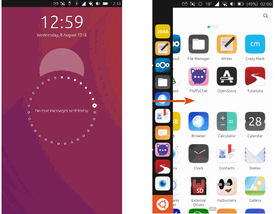
                                                Like the desktop version of 16.04 Xenial, Ubuntu Touch has a sidebar (Ubuntu Launcher or just Launcher). As expected, swipe from the left edge for this or choose to have it showing all the time if you prefer. Apart from the standard icons, you can arrange them differently by long press and drag. On mobile devices the Launcher icon is at the bottom – nearest your thumb – but in Desktop use it moves magically to the top.  As you can on a desktop, you can also pin your favourite apps to the dock or unpin those which you don’t use much. With the app open, long press it in the Launcher and you will get the pin dialog. Launcher indicates running apps with a white circle.

                                                The right edge does two different things

                                                A quick swipe does exactly what you would expect. If you have more than one app in use it will switch between them.    
                                                      
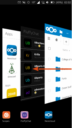
                                                If you slow swipe – which takes some practice – the view opens up like a concertina or a hand of playing cards. You see all of the open apps in a row. Now you can do one of two things. Touch one of the displayed apps and it will open. Drag an app either upwards or downwards and it will close and disappear.
                                                Odoo text and image block
                                                LionelB  says "This is very easy and very quick. You will soon find that it is a great way to navigate". Wayne Taylor says "I switch between open apps with a very brief swipe from the right - not even as far as the middle. I open the 'deck of cards' view with a fast movement but I take it much further over to the left. Switching between scopes I do by sliding towards the left, like turning the pages of a book - super intuitive.  Love it".

                                                Often in Ubuntu Touch there is more than one way to do thing. Every user will decide what suits them best.

                                                In Ubuntu Touch you can open as many apps as you like at the same time but ‘open’ does not mean the same as it does with other operating systems. With Ubuntu Touch’s competitors, apps which are running in the background typically are able to monitor – some would call it spy on – the activity in the app which you are using. In Ubuntu Touch, apps running in the background (with a few exceptions) use no resources and there is a system in place to confine apps so that they are unable to see what other apps are doing. This is usually called ‘sandboxing’ and it is basic to the way that Ubuntu Touch works. It is not an afterthought but safeguard of privacy.           
                                                At the top edge is the Notifications Bar

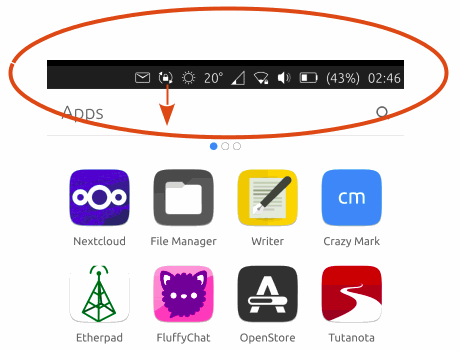
                                                We should really call it something else (perhaps because it does many things. The normal view is un-expanded and is very familiar. Here you can see that messages have arrived and that the battery charge is low. The expanded view is obtained by pulling the bar downwards. Very familiar. Press on the message icon and you get a box where you can write a quick reply.
                                                        
                                                In the expanded view you get something very similar to opening up the Settings app, with wifi, calendar, Bluetooth, sound etc. You can even report a bug from here!           
                                                Odoo text and image block

                                                However, one thing makes Ubuntu Touch unique in this area: you can scroll left and right through all the options at the top once expanded.  What this means practically is that the user can access nearly every useful thing (ie. bluetooth, wifi, settings, message notifications, location on/off, etc) without having to go through different doors.  This intelligent user experience can only truly be appreciated by trying for yourself - you won't be able to return to the competitors after this one!

                                                The fourth edge…

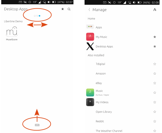
                                                The bottom edge is used for swipes too. Exactly what it does is decided by context. It depends what you have on the active page. Although the purpose varies, this is where you make choices. Settings and customization. This was where you selected or removed scopes but with fewer of them, this matters less. It still works though.  A very unusual but interesting scope is Libertine. It is hardly a    scope at all in fact but what it is designed to do is to host desktop apps in something like a virtual machine environment. Not all desktop apps will work in it it and like many things in Ubuntu Touch it needs more input from our limited resources. This is where         you might try LibreOffice, GIMP and Firefox but remember that scaling is not available for these and while hosted on a phone they     are intended for viewing on a large screen. Those hosted apps appear as icons in the normal way.  At this stage of development, it is a good way to quickly experience a limited 'convergence' experience which is a key feature of Ubuntu Touch.

                                                To change the app order in the Apps scope, just long press and drag. There is an app called Falcon (https://open-store.io/app/falcon.bhdouglass) which will give you more customization, including new icon sets.
                                                        
                                                Odoo text and image block
                                                        Organize your scopes in the same way, by swiping up from the bottom edge when you are in a scope. This will decide the scopes order when you swipe them to the left.          
                                                                
                                                        It is the combination of all these things - simple controls, easy to understand design, and the ‘convergence’ of mobile and desktop  - combined with an open source, privacy respecting philosophy, that makes Ubuntu Touch such a special and enjoyable operating system.          
                                                         
                                                        Try it, tell us about your experience, and make suggestions for improvements. UBports is a community project. Your project!
                                                                  background_background_header@2x.webp
                                                                  16.04 Showcase Aftermath
                                                                  A Taste of Things to Come